
In the dimly lit realm of cinema, where shadows dance and light whispers secrets, a subtle yet powerful tool shapes our emotional journey: color grading. Once a delicate brushstroke on the filmmaker’s canvas, this artful manipulation of hues and tones now often stands at the forefront of visual storytelling. But as audiences find themselves enveloped in teal-tinted dystopias or bathed in the golden glow of nostalgia, a question arises: Is color grading being overused to craft moods that feel more synthetic than sincere? This exploration delves into the vibrant spectrum of opinions surrounding this cinematic trend, seeking to unravel whether the magic of color has become a mere illusion.
Crafting Cinematic Atmospheres: The Role of Color Grading
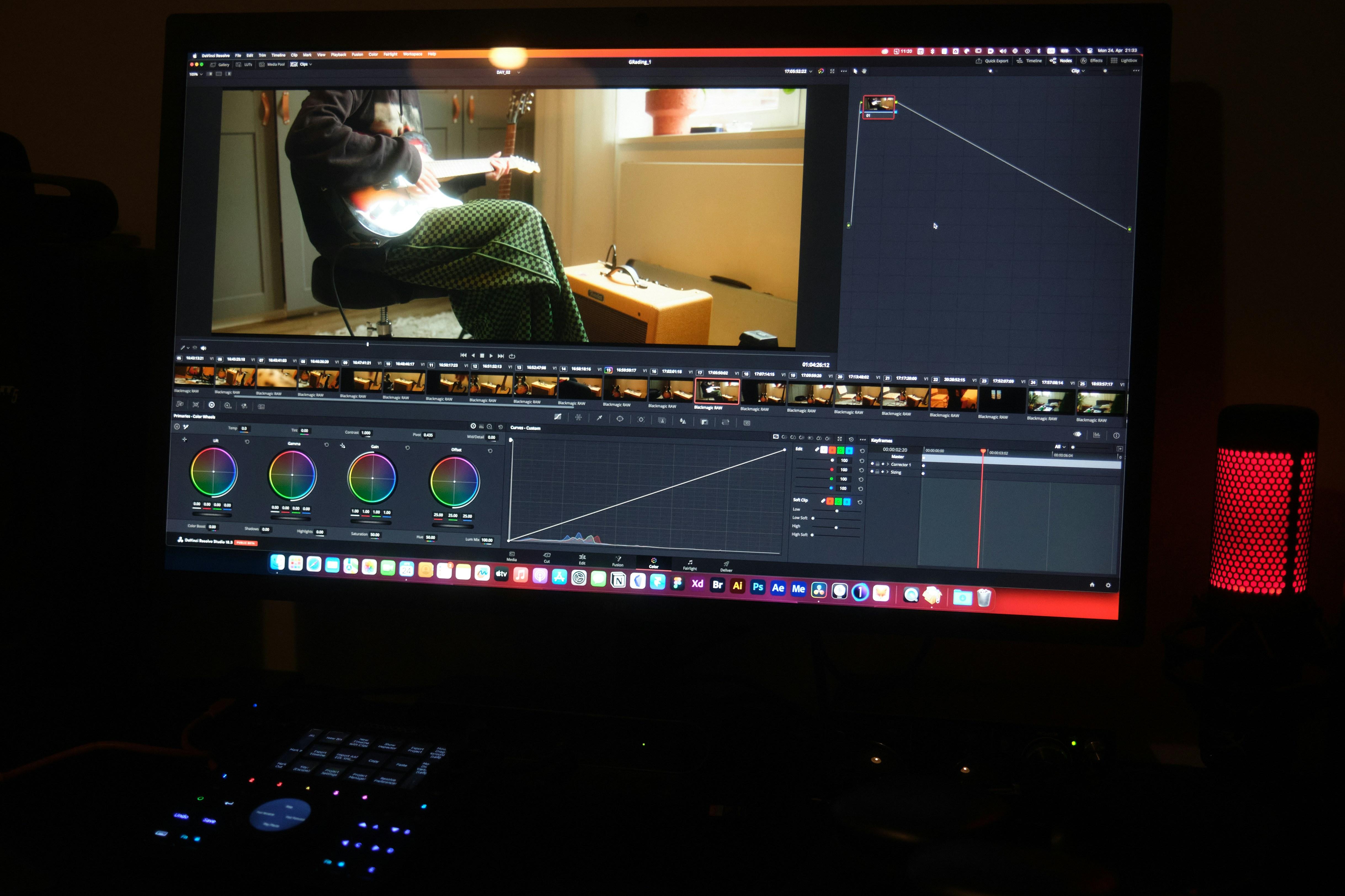
In the realm of modern filmmaking, color grading has emerged as a powerful tool to shape the viewer’s emotional journey. By altering hues, saturation, and contrast, filmmakers can transport audiences to entirely different worlds or subtly manipulate emotions. However, the art of crafting these cinematic atmospheres requires a delicate balance. When overused, color grading risks creating artificial moods that may detract from the authenticity of the narrative.
Consider the following aspects when evaluating the impact of color grading:
- Storytelling Enhancement: Thoughtful color grading can underscore themes and motifs, enriching the storytelling experience.
- Emotional Resonance: Colors can evoke specific emotions, enhancing the viewer’s connection to characters and scenes.
- Visual Consistency: A cohesive color palette ensures a unified visual language throughout the film.
While the strategic use of color can elevate a film, over-reliance may lead to visuals that feel contrived or overly stylized. Striking the right balance is key to maintaining the integrity of the film’s narrative and emotional core.
From Artistry to Excess: When Does Enhancement Become Overuse
Color grading is a powerful tool in the filmmaker’s arsenal, capable of transforming raw footage into a visually cohesive narrative. However, its excessive use raises questions about authenticity and artistic intent. When does the delicate touch of a colorist shift from enhancing a story to overshadowing it? This is a growing concern among critics and audiences alike, as films increasingly lean towards hyper-stylized visuals that can sometimes distract rather than complement.
- Visual Consistency: Color grading ensures a seamless look, but overuse can lead to an unnatural uniformity that feels forced.
- Mood Manipulation: While essential for setting tone, excessive grading might impose a mood that conflicts with the narrative’s genuine emotional arc.
- Loss of Authenticity: In the pursuit of a distinct aesthetic, filmmakers risk alienating audiences seeking genuine storytelling.
Striking a balance between enhancement and excess is crucial. As the line blurs, filmmakers must ask themselves whether their use of color grading serves the story or simply indulges in visual excess.

Balancing Vision and Authenticity: Navigating the Color Spectrum
In the world of cinema, finding the sweet spot between creative vision and genuine storytelling is a delicate dance. Color grading has emerged as a powerful tool, offering filmmakers the ability to enhance visual storytelling. Yet, when does it shift from enhancing to overshadowing the narrative? This process, when used thoughtfully, can emphasize themes, evoke emotions, and create immersive worlds. However, over-reliance on color manipulation may risk crafting an artificial atmosphere that distances the audience from the authentic essence of the story.
Consider the following impacts of excessive color grading:
- Visual Overwhelm: Excessive hues can distract rather than complement the narrative.
- Emotional Disconnect: Overly stylized palettes might alienate audiences seeking realism.
- Uniformity Risk: A trend towards similar color schemes could diminish uniqueness across films.
Ultimately, achieving a balance is key. Filmmakers are tasked with the challenge of maintaining their unique vision while staying true to the story’s core authenticity.
Recommendations for Filmmakers: Striking the Right Hue
Filmmakers aiming to balance mood with authenticity should consider a few key recommendations when employing color grading. Subtlety is crucial; an overly aggressive color palette can overshadow narrative elements, making the story feel contrived. Instead, use grading to enhance natural tones and support the film’s emotional journey without overwhelming it.
- Understand Your Story’s Essence: Align color choices with the core themes and emotions of your narrative.
- Experiment with Restraint: Test different grading techniques on small scenes to evaluate their impact.
- Seek Feedback: Collaborate with peers or conduct test screenings to gauge audience reactions to your color choices.
Ultimately, the goal is to complement the storytelling rather than dictate it. By thoughtfully integrating color grading, filmmakers can craft a visual experience that resonates deeply with viewers while maintaining the story’s integrity.
